If we learned anything this year, we learned that mobile is everything when it comes to eCommerce. In fact, 78% of searches for local business information completed on mobile devices ended in a purchase, and 85% of adults believe a mobile site should be better than, or at least equal to, a regular desktop website.
The irrefutable statistics coupled with the many different mobile devices on the market today create a scenario where eCommerce sites must consistently work well regardless of screen size. Enter responsive web design, a single design solution that conforms to the requirements of any digital device.
As the year comes to a close, let’s take a look at 10 of the greatest mobile eCommerce sites of 2014. Perhaps you will gain some inspiration for your own future work as you take a lesson from some of the best in the game.
1. Starbucks

As if you could expect anything less, the hip coffee-brewing powerhouse uses a simple, effective responsive site. Seasonal gift offerings are listed by collection and highlighted with clean, simple images. The site’s mobile view condenses pleasantly without leaving out any menu items or descriptions.
2. JustFab

An online fashion site selling discounted items requires a seamless transition from desktop to mobile. Focusing on shoes and other fashion and accessories, JustFab provides mobile shoppers with lots of options. These many options are abundantly showcased, with multiple products and slideshows on the mobile screen.
3. CJ Pony Parts

Speaking of effective slides on mobile sites, CJ Pony Parts, a car part retailer, also does a great job condensing their vast menu for the small screen. The mobile homepage emphasizes the search bar, likely the easiest navigation for someone shopping on the go, while also offering up a drop-down menu for browsing.
4. SuitSupply

A high-fashion site such as SuitSupply should focus on showcasing products through stunning photography. SuitSupply condenses high-grade images on the mobile site and pairs them with a simplistic grid layout that moves and rearranges itself as you resize the window.
5. Tattly
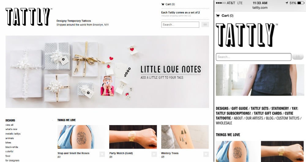
Once again, grids transfer delightfully to the mobile site. Tattly is an example of a site that appropriately focuses on its products’ creativity, and therefore highlights them by employing a plain, monochromatic color scheme. This minimalist approach transfers beautifully to mobile, where black text and images of their tattoos pop against the stark white background.
6. ModCloth

ModCloth constantly throws new images into their slider to keep things interesting, and the slider plays a prominent role on both desktop and mobile. Their homepage offers viewers a variety of ways to explore their products, especially on desktop, where they have room to break out into dozens of different categories. Mobile offers up a more straightforward navigation based on the type of clothing.
7. Renewal by Andersen
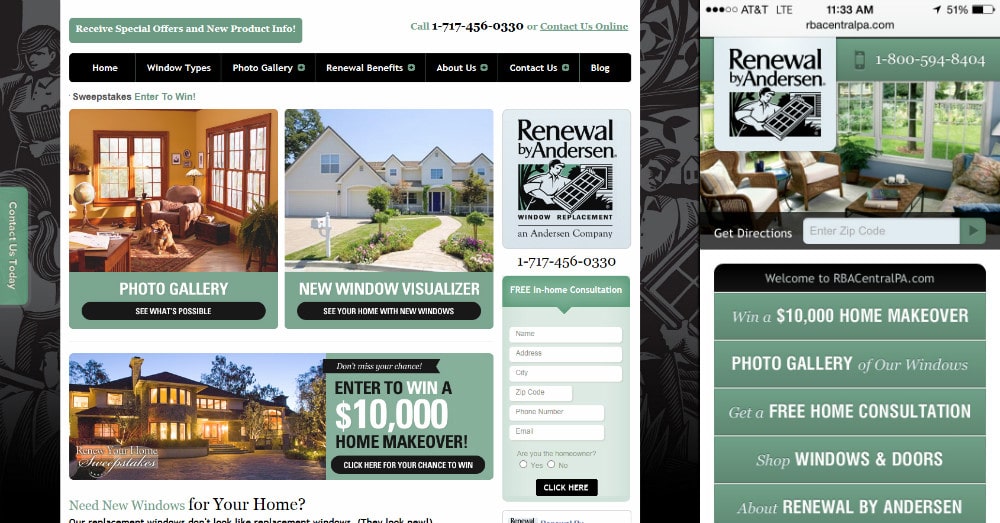
Renewal by Andersen, a window company, uses a simple yet well-done grid layout on a responsive site. On mobile, the boxes on the homepage condense to flyout menus, putting more options above the fold.
8. Five Simple Steps
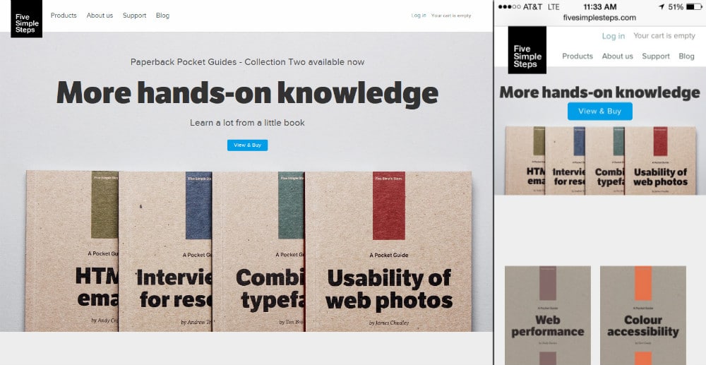
Five Simple Steps offers mobile users ease of use coupled with aesthetically pleasing colors and minimal design. Another wonderfully simple mobile site that proves nothing beats simplicity for many brands.
9. Firebox
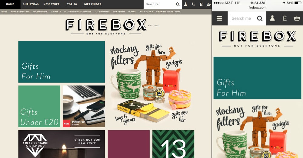
A spectacular flat design, Firebox condenses their many menu options down to the essentials on mobile. In addition, the grid layout is extremely clean and perfectly showcases their quirky and colorful products in a way that isn’t kitschy or clashing.
10. Currys
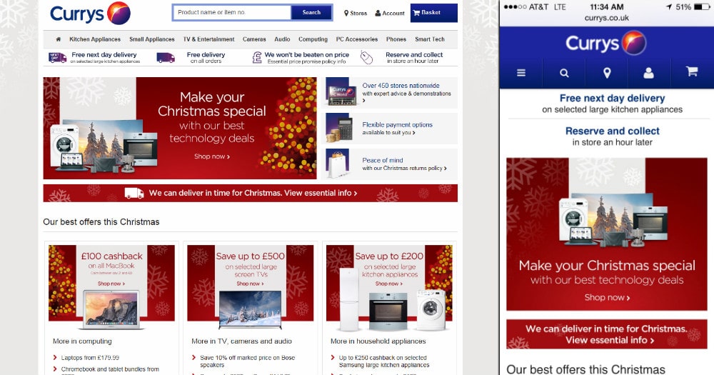
Currys was one of the first very large-scale eCommerce sites to make the switch to responsive. While the design isn’t the most beautiful out there, the scale of it is impressive; such a vast site comes with its own set of considerations when switching to responsive. There is much to be learned from Currys’ packed mobile site.
Hopefully the above 10 examples provide some inspiration for the upcoming New Year. Most users prefer a functional website over an app; they don’t want to interrupt their browsing to install an application. Responsive design is becoming increasingly essential as more users start to browse the web on small screens than desktops. Bring the masses what they desire in 2015. Utilize brilliant responsive designs that will satisfy your clients by increasing their ranking and mobile sales.


0 Comments