CSS Flexbox is the new part of css3 it allows you to create super complex and super flexible layout with CSS. When you work with responsive web design, you will find yourself with a combination of floats, heights swell as any number of hacks to get things done.
CSS Flexbox aims to get rid of these hacks and let us create flexible layouts. CSS Flexbox controls the position, size and spacing of elements about their parent elements and each other. By using flexbox css, we can quickly build complex layouts like navigations bars and menus, grid layouts, bar charts and more.
Even though the browsers do not entirely support flex box, people are started using flex box. It is excellent idea to keep fallback options like moderniser.
In this post, you can see a great resource of flexbox tools, cheat sheets, reference, frameworks and much more.
Flexbox Based Frameworks
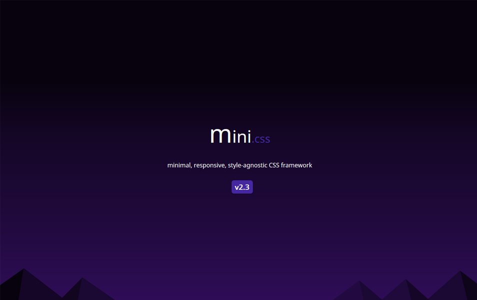
mini.css
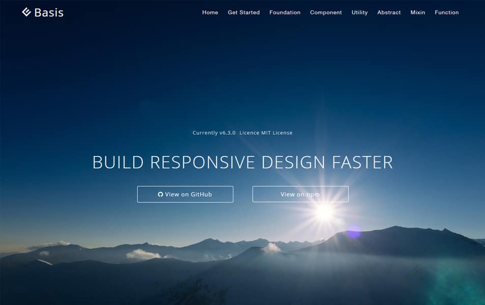
Basis
Grd

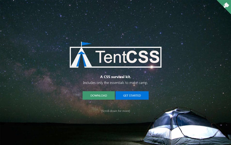
Tent CSS
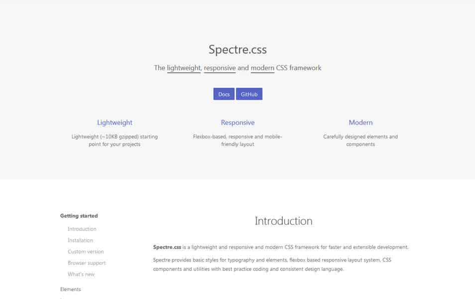
Spectre.css
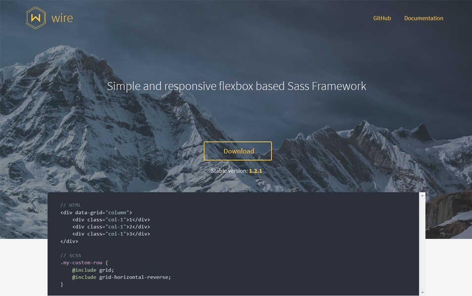
Wire
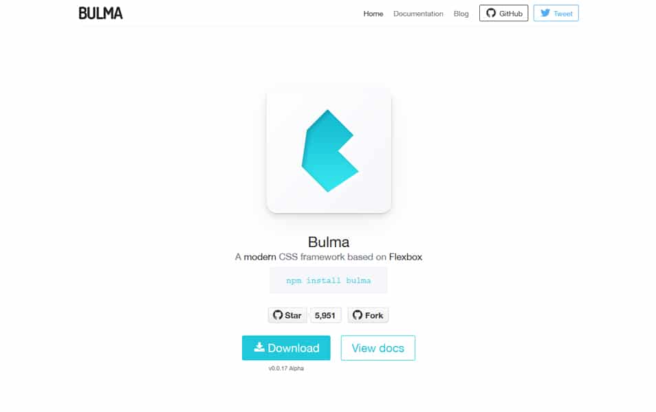
Bulma


0 Comments